http://www.youtube.com/watch?v=QJO3ROT-A4E&feature=g-music&list=MGGB&context=G1e834YMAAAAAAARAA
The genre of this video is pop, aimed at in particular teenage girls. Throughout the video is shown the 5 boys messing about with eachother on what looks like a stereotypical summer day by the beach. This appeals to teenagers as the beach scene is very eye catching as attractive scenery has been used.
There is a link between the music and visuals as the cuts of the footage are in time to the beat of the song which allows the viewers to keep up with the video and it doesn't appear too rushed or too slow either. At the start of the video one of the band members taps on their steering wheel to the beat of the song, this shows a good opening to the song as the song is very upbeat and lively. When the artists are shown they often walk or move to the beat of the music too, which adds to the effect of the music.
There is a link between the lyrics and visuals as the artists are often shown looking directly into the camera and singing the lyrics of the song, this is done in different locations and is a nice peice of footage to cut away from. One line reads 'the way that you flip your hair' when this line is sung a young girl is shown flipping her hair, this is a clear link between both the visuals and lyrics. While the line 'you don't know you're beautiful' the artists point to the camera which involves the viewer and makes us feel as though we are taking part of the video without being there or even knowing the artist. Near the end of the song one of the artists is shown singing directly to a young girl, this links the lyrics and visuals as the song is aimed at a young girl so we now can draw that link.
Many close ups of the artists alone and as a group are shown, this is so we get to know the band members as individuals but also as a group all together.
Thursday 15 December 2011
Music Video Director.
Marc Klasfeld is the director of many award-winning and
breakthrough music videos for artists such as
-Katy Perry
-Jay-Z
-Red Hot Chili Peppers
-Foo Fighters
-Nelly
-Sum 41
-Avril Lavigne
-Beyonce
-The Script
-Ludacris
-Eminem
-Enrique Iglesias
-Justin Timberlake
and many more.
Many of his videos have shown him as a director with a very unique style. One video in which he directed was TGIF - Katy Perry.
http://www.youtube.com/watch?v=ybLrdztNWms
In this video in particular the colours are very bright and using a large range, this immediatley makes the video stand out and draws the viewers attention.
The lyrics and the visuals often link, for example at one point of the video the lyrics read 'is this a hickey or a bruise' and points to the bruise on her neck which is the one she is refering to. The musics and visuals also link as the image often cuts on the beat of the music to allow the change of footage to be softer and flow easier.
Close ups on Katy when she is the 'geek' and after her transformation are shown to allow the viewers to link the two people together to see her before and after.
Intertextuality is used in this video as the people at the party are showing playing on the game 'just dance' this links the music video with the video game which allows the two media products to work together and promote the game 'just dance'
Analysing a Professional Music Video using Goodwins Theory
JLS - She Makes Me Wanna
I have chosen this example as although the concept is unlike the one that we used within our project, the song is of a pop genre and quite upbeat and fun which is something that we explored within our video.
Genre characteristics
This pop genre music video by a young boy group demonstrates clear genre characteristics. The music video shows the young and attractive boy group performing a dance routine whilst singing in all of the video. There are also shots of the band members close-up and also topless in order to appeal to the target audience of teenage girls who adore the band. The video also contains lots of lively visuals including bright coloured clothing and a crowded beach location in order to portray the pop genre.
Music and visuals
There is a really strong relationship between the music and visuals in this music video which is really effective. The video is set in a beach location where we see the four group members and lots of people partying/having a good time which is shown by the energetic dancing etc of everyone. We see the four group members dancing on different raised surfaces (e.g. rocks, dance platforms) in the most of the video in order to make them clear to the viewer. They dance a routine which has been specifically co-ordinated to the song and the lyrics in it so that the band members move along with the song. This is effective in making the song more memorable for the audience and also providing them with the upbeat feel and atmosphere from the song and video. Also, the dancing people in the background of the video are jumping and moving in a specific pattern in order to emphasise the lively music and general atmosphere of the video. The editing of the shots in the video also links the music and visuals together strongly. Quite a lot of the cuts and fades in the video, which transfer us from shot to shot, cut on the beat of the music and therefore give the video a more professional look and make the video run more smoothly.
Lyrics and visuals
There is also quite a strong relationship between the lyrics and visuals in this video. Firstly, as the video starts and the song is introduced we see the artist and song name appear on screen. The song name ‘She Makes Me Wanna’ is typically one of the main lyrics in the song and is repeated four times within the chorus. Secondly, the lyrics for the song generally talk about how the band members are intrigued and interested in a (not specified) female who is referred to as ‘she’ in the song. The video shows a variety of shots of young attractive females which are partying in the video, and not wearing a lot of clothes. The use of these shots emphasises the point of the song and that the singers are talking about a girl.
Demands of the record label
There are also clear demands of the record label with in this music video. The video features lots of close-ups of each band member in the group as well as long and mid-shots of the band together. There are also shots which feature a couple of the band members shirtless in order to appeal to stereotypical female teenage fans.
Objectification of women
The video also demonstrates objectification of women. Like previously said the band talks about a female within the lyrics and due to the band members being young and attractive the video features young and attractive females too. As the location used in the video is a beach these females wear hardly any clothing e.g. bikini’s/shorts and t-shirts which show off their feminine features. Some of the shots used emphasise this objectification of them e.g. close-ups, and low angle views which allow the viewer to focus on the body of the woman. This is used to highlight the theme and narrative in the video.
Analysing Student Music Video
I particularly like this work as I feel that there is a strong realtionship between the visuals and lyrics. I really like how unique the story line is I feel is works successfully. I also like how the genre of the music is shown very clearly, I finally like how they show the band playing it works really effectively
Analysing Real Magazine Ad

Analysis of Music Video Using Goodwins Theory
http://www.youtube.com/watch?v=SDTZ7iX4vTQ&feature=related
I have chosen to analyse Pumped up Kicks by Foster The People. I feel that this professional music video links particularly well with our music video and concept as a whole. From first veiwing the music video it is very clear, that this is an indie pop band and the music video demonstrates genre characteristics very well. The Band are introduced, with shots of them as a group.

I have chosen to analyse Pumped up Kicks by Foster The People. I feel that this professional music video links particularly well with our music video and concept as a whole. From first veiwing the music video it is very clear, that this is an indie pop band and the music video demonstrates genre characteristics very well. The Band are introduced, with shots of them as a group.

The music video also shows the band playing at a live gig which allows the liping sinking to also be involved within this part. There isnt a hugely strong relationship between lyrics and visuals, although it shows a combination of illustrative and contradicting relationship, as the strong line is strong but doesnt specifically link with the lyrics as a whole.
The are a very strong relationship between music and visuals, whenever the chorus takes place the footage jumps back to where thay are playing live on stage, this could also be demands of the record label to develop motifs and begin to introduce tha band as a whole to produce a strong following for them all.
The reason why i think it links well to our music video as it has the hazy effect over the music video as a whole, i also feel tat the music video has a very similar concept through the whole video - friendship. I feel this music video is interesting and works well with the song.
Looking back at our storyboard
After finishing our project, we re-looked at our storyboard to compare how far we stuck to our original idea for the video.
We stuck to the head shots of the people in the video but certain things changed as they were all holding a piece of food instead of things to play with like the bubbles. We still used many long shots of the group all together but we used more close up shots on the action. We couldn't stick to some shots as we couldn't find a parachute.
I think that we did stick to our idea well but some shots we couldn't do due to not having the correct equipment.
Editing of our Music Video


These are screen shots of our project in final cut, we used different lines as we felt this was a lot easier to move about and everything wasn't squashed together.
Directors Commentary/behind the scenes - Professor Green.
This is the directors commentary/behind the scenes footage for one of Professor Green's latest videos. The way it has been done is very effective. There seems to always be the track playing the the background, which then goes quieter when people are talking about the video to the camera.
The video interviews all the main people involved in the video with them explaining different parts of the video. A lot of the commentary is done from the artist himself, Professor Green, as it is his video that they are creating. There is also footage of how the director thought of, wanted to do the video so that you can see how the video came about.
Wednesday 14 December 2011
research on a music video director

- Black eyed peas
- Snoop Dogg
- Rihanna
- Jay-Z
- Muse
- and Beyonce
he currently has begun to direct feature length movies and is Directing the movie 'Vlad'.
http://www.youtube.com/watch?v=rp4UwPZfRis&ob=av2e
http://www.youtube.com/watch?v=rp4UwPZfRis&ob=av2e
Auteur Theory
Auteur Theory is where the director is given full control over the creation of the media product ,e.g music video, and the director can be seen as the creator of the video rather than just piecing together pre-designated ideas and shots, this has lead to, in films for example, for the directors name to be the main one in the credits as the composition of shots, lighting and mise en scene are more important for the feel of the video than the literal speech, as apposed to the screenplay writer as you might expect.
Analysing a past students Music Video using Goodwins Theory
The genre of the song in this music video is a rap R&B style song which is sung by a male singer and in the video the characters are playing up to a typical stereotype of a rap singer. The music video is created with a humorous side to it and is seen as a parody style video. Also, because of this we see the characters/singers wearing tracksuit bottoms, t-shirts, baggy jeans, hoodys, hats and gold jewellery (e.g. chains) etc. We also see them hanging in a gang around council house, graffiti covered, and grotty street locations. Both of these stereotypically suggest that the characters are hooligans.
Visuals and Lyrics
In this music video there is not really a relationship between lyrics and visuals. With the visuals we mainly see two out of the four characters lip-synching to the music whilst wandering and hanging around several of the described locations. The lyrics talk about the rappers career and where it began etc although the lyrics are hard to follow because the rapper is rapping quite fast. We only see a slight relationship between the lyrics and visuals where at the beginning a female voice says ‘London England’ as the rapper gets out of a car in a street location and therefore the location could be suggestive of some areas in London. Also later on in the video the words ‘Stop Complaining’ are sung and when they are these words are written with a pen on screen. Otherwise in this music video the students do not relate to any of these lyrics. It seems as if the students have taken on board the genre of the music in this video more and related it to what their stereotype of this genre is and recreated it with a humorous feel around it. Linking the lyrics and visuals thoroughly could have been difficult/not possible with their ideas or timescale for example therefore they may have decided to approach it differently.
Music and Lyrics
There is quite a strong relationship between the music and visuals in this video due to the way the students have edited their video. Due to the strong beat in the song which continues throughout they have cut many of their shots on this beat in order to link the music and visuals and provide an easy to watch music video which flows in pace. They do not however continue this throughout their video and sometimes have cuts on every two beats and three beats etc which is not as successful in my opinion. They also link their music and visuals in their video by the way in which some characters dance humorously and do certain actions on the beat of the song.
Demands of the record label
There are clear demands for a record label as there are frequent close-up and mid-shots which are shown in the video. The use of these shots gives the video more of a professional feel and also allows the audience to identify the characters, especially the main two singers that appear in most close-up shots. The humorous dancing that the characters also do to the beat of the song could be identified as a recurring motif in the artists work.
Intertextual references
As the theme in this video is ‘gangsters’/hooligans hanging around in groups there could be several Intertextual references made to films/music videos/TV programmes with similar content in. I know myself that I have seen similar locations and actions before within the media but cannot think of any specific examples. Musicians like Drake records rap music and in some of his videos he wears baggy jeans, gold jewellery etc and this could be linked to the stereotype of the music and figures we see related to it. The film ‘This is England’, which I have myself seen parts of, documents unruly young adults and their dangerous street lives. This could be compared to the stereotypical street location or clothing that the students have used in their video.
Analysing A Professional Digipack

This is Nero's latest album digipack, the theme used across the entire album was retro futuristic and this can be seen clearly throughout the design with the old arcade space invades style font and angular shapes this logo is used across all of neros publications.
The product is fairly simple in an attempt to draw focus to the group name with a picture of two people most probably the two members of Nero on what appears to be a space age landscape, again fitting in with the concept chosen throughout, the disk art and back cover are kept to a minimum with little unessential info and what is there is kept to a minimum using small fonts and pushing things such as publisher info into the corners to create negative space, used to draw the onlookers eyes to the band name, which is the only thing using bold crisp white colours.
Overall i think that this digipack is a perfect example of a proffesional product and shows clearly how effective a choice of font, layout and styling can be used to create and enforce a theme which can be carried across multiple products.
Analysing a past student digipak
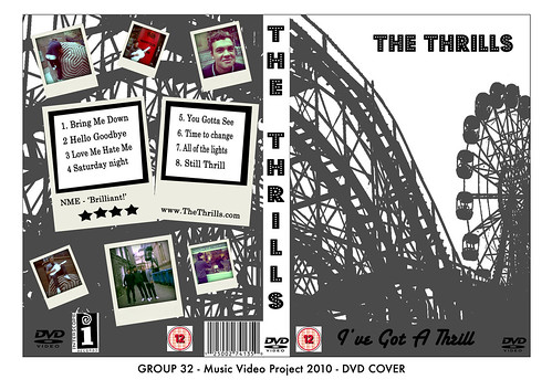
this past student digipack dvd cover, there artist name is the thrills and clearly the roller coaster imagery in the background fits well with the name the picture is used effectively and the way in which it stretches across both front and back really adds to the professionalism however i think the spine should continue the picture as well as to not break up the image, the way in which photos and track info has been added to the back of the product really suits the rest of the styling as the polroid style printouts go well hand in hand with the theme park concept.
the only major problem with this otherwise proffesional looking product is that the information such as the BBFC rating and bar code looked rushed as they are inside a white box and as such look copied and pasted from Google. If not for that one problem i think that this digipack could easily pass as proffesional.
research into directors commentaries
A directors commentary is usually a voice over or footage of the creator of a media product talking about and justifying decisions made throughout the creation of the product, this could be why they chose the location or actors, style or any number of things in the video, it is created to enable the viewer to grasp a better understanding of the product so that it can be enjoyed on a different level than the norm. it is often shown over the top of or with clips of the actual product, this allows the director to be specific about what they are talking about as if the viewer were watching it with the director.
past student commentary
http://31longroadmusicvideo10.blogspot.com/
this groups commentary was different to most other groups i saw, it started with a brief clip of there music video then the first question faded over the top before a transition to the group sitting together, this was effective in the sense that it gave the viewer a clear sense of which video and what part of it the group were talking about. The group had chosen to make the video in the style of the interview, and while they pulled this off well it didn't make the product look convincing and proffesional as most real commentaries show only the artist or artists between clips of footage, they however filmed parts of the production process (e.g final cut) which really helped to get across to the viewer what they were trying to describe and also added a proffesional look to the product.
The group seemed confident in there speech and it sounded like they had for the most part planned it out well and were clear on what needed to be discussed without making it look as if it was being read of a script.
Analysing a past groups magazine ad
this is a magazine advert made by a previous group and was one of the bet ones I saw, it follows most of the conventions expected in a magazine advert playing focus to the artists name, the effects and styles used are effective but do not completely comply with the desired genre, the torn effect and offset of the photo at the bottom of the page are both eye catching features but means that the size of the advert will have to be reduced on the page making the information smaller and therefor less noticeable, the photo itself is of good quality and clarity but looks as if it has been put through a blue filter which doesn't stand out enough to become eye catching and instead reduces the quality feel of the page.
the information included on this advert is;
- artist name
- album name
- release date
- review
- website
it could do with having more information added ,e.g publisher info, to make the product look overall more proffesional.
Research into a Director's Commentary
A director’s commentary is (normally) a piece of footage in which the director explains their intentions within the media product that they have created. This usually includes the director talking about what their aim was within a scene and why they chose a particular location, colour scheme, costume etc as well as what they intended to achieve and portray to the viewer because of their choices. A director’s commentary can also more simply include the director talking the viewer in more detail about everything that happens within a scene in order for them to understand what is going on. Director’s commentaries are really useful as they allow both the director and the public to get an insight into what inspired the director at specific points in their media product and most importantly what the director wanted to achieve and create a sense of in their media product.
It also gives a chance for the director to review their work from their own perspective and talk specifically about what they thought was successful or unsuccessful within their piece of work. Director’s commentaries are usually footage of a director talking directly into the camera with the footage of their media product being inserted at the necessary points for the viewer to see. Another popular way is having the footage of the director’s media product playing on screen and having a voice over of the director talking about their work. This provides the audience to follow what the director is saying more successfully.
Analysing a professional Digipak

Rihanna is an extremely popular, well known and loved female R&B/pop singer of our generation. This digipak is for the artists album titled ‘Loud’, released 2010, which was a huge success with the general public for its fun and upbeat vibe.
The title of the album ‘Loud’ is cleverly reflected within the album imagery/artwork. On the front cover of the album we see a close-up shot of the artist looking down with her lips parted. The pose she undertakes is quite posed and in this way emphasises her femininity. Due to the artist looking away/down in the image the pose portrays a vulnerable yet sexy and mysterious side to the artist which is emphasised further by the artist’s image. It is also quite personal and enclosed pose as the artist is not revealing her face or body etc to the camera. The image is really exciting and eye catching due to the use of the vibrant red colour of the artist’s hair, long curled eyelashes and also the bright red lips, which are defined beautifully. The combination of these emphasises these feminine features of the artists and portrays her image as vibrant and sexy to the viewer. The font used on the cover is thin and coloured white to stand out against the bold vibrant colours that dominate the rest of the cover. The style of the font is however quite subtle and therefore allows the daring image of the artist to be the emphasis of the cover and catch the viewers eye.
The theme of femininity is also continued throughout the digipak with the use of vibrant, bold and feminine colours. In the inside fold out cover of the digipak there is a large visual image of the artist. In this image we see the artist in a white, lacy two piece dress which is flirty and feminine. She appears in a trance by the way that she lies against a bush of bright red flowered roses, smelling them and appearing caught in the sensational moment. The artist therefore appears allured by both the roses, and her surroundings. The use of the bright red roses again emphasises the artist’s femininity and continues the theme of the red throughout the album. The rose is also a portrayal of beauty, passion and love and by including this it is suggestive of the theme within the artists work and also a representation of the artist herself.
The artwork on the CD itself is an image of a flourishing rose. The colour of the CD is a softer light pink colour which gives a more innocent and laid back feel. The simple rose image is really pretty and gives a nice finishing touch to tie in the theme of the digipak. The artists name, album title, producers and record label as well as website address are printed on the CD in small print giving a professional touch.
Overall, I really like this digipak due to the stunning artwork and imaginative concept to the album as a whole which is really brought out within. The choice of colour scheme and imagery is also successful in creating a portrayal of the theme that the artist intended for the album and also a portrayal of the artist and her personality.
Tuesday 13 December 2011
Analysing a professional magazine ad

this magazine advert for chase and status is made to promote the groups album tour its imagery bares no literal relevance to any tracks in the album but is used to underlay a concept to be used throughout, as we see the same images twinned with the same fonts and styles in all album related products {e.g digipack). having this lack of relevance allows you to see the album as a separate product rather than following the styles of a single individual track. the choice of colours allows the writing to be easily read and to stand out amongst the background creating a 3d style effect.
the layout of the advert draws focus to certain aspects of the information the groups name is largest on the page with the venue second this makes it clear to the reader what the advert is promoting, where as for example if the venue was larger it would look as if it were that witch was being mainly promoted.
All relevant information is included on the poster shown in order of importance down the page with the date first followed by contact details,ticket website details, album details and group website details.The producers details have been placed in the lower corners as to be prominent but without drawing the readers eye from other aspects of the page.
overall this advert clearly outlines all key information needed while still showing the key styling of the tour allowing the page to be both eye catching and informative
Analysing a professional Magazine Ad

Britney Spears is an extremely popular and well known musician, singer and actress. She is considered the princess of pop and has had many number one singles over the past 15 years. The image above is a magazine ad for an album she released in 2008. The album is called ’Circus’ has a fun and quirky pop/dance feel around it and is quite shows different sides to the artists personality. The imagery of the album is very much themed around a circus and the goings on in one.
I really like this magazine advert as it is quite eye catching and fun and has an original idea around it as well as looking professional. The magazine ad, like the album, encompasses a circus theme in which the magazine ad replicates an actual circus poster. The magazine ad uses an eye catching yet classic colour scheme of cream, red, mustard yellow and blue and this gives the ad a realistic yet vintage style which circus posters traditionally have. The font used is very bold and vintage styled in order to grab the eye of the viewer and again replicates the font used on a traditional styled circus poster. Britney’s name appears very large and in bold 3D lettering a quarter of the way down the image, with the album name and other info in smaller letters underneath in order to catch the viewers eye first. To emphasise this circus theme and portray a real circus poster the magazine ad features a vintage baroque pattern which is placed at the top and bottom of the ad drawing the text inbetween it together and giving the poster a classic touch. It also has 3 stars which appear either side of the release date of the new album, highlighting it and again replicating the traditional conventions of a circus poster. This whole grouping of text is featured within a border which again helps to draw the viewer’s eye towards the lighter coloured background and text in the middle of it.
Britney’s record label’s logo also appears in the top left hand corner of the magazine ad along with the entertainment industries logo in the right hand top corner. Both of these give the magazine a professional feel but still remain subtle and part of the poster by the colour they are presented in. Her website address is also featured for publicity and easy accessibility to fans. An extra is also added to the magazine ad in the right hand bottom corner of the magazine ad in a scroll shape. This contains quirky phrase and number for fans to call Britney, suggesting that she is the performer, but is a pun in order to follow the conventions of a proper circus poster and have fun with the concept.
Overall, I find this magazine ad extemely successful as it a really original and fun idea that follows the theme and concept of her new album. This is important as it enables fans and the public to be able to identify her work. I also like the fact that the magazine ad has a unique idea and is not just a posey image of the artist herself, like the work of other pop artists and find it really interesting.
Analysing past students Magazine Ads
Group P2-10
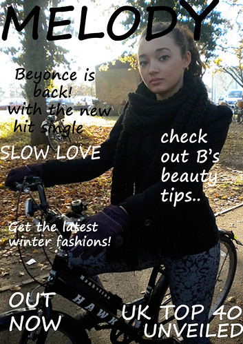
Here is a magazine ad by previous students for their music video project. They focused on an R&B genre for their music video due to the style of song that was chosen. Although the magazine ad is not particularly suggestive of the R&B genre or slow, romantic styled song it does represent the genre by the way that the artist is a young, dark haired and olive skinned female as a lot of R&B signers in the current industry have this representation. I do not however feel that the magazine ad is at all successful due to the unprofessional and rushed feel to it. It also does not feel as if the group have thought about the genre and their idea properly although the written work on their blog does contain a lot of ideas. In my opinion they seem to have misunderstood the task and created a magazine cover rather than a magazine ad promoting their artist/song.
Firstly, the image they have used on their background does not feel very professional due to the artist being sat on a bike in front of random buildings and trees. On their blog the group commented on how they had taken the images surrounding trees to link in with their music video and some shots in it but in my opinion this is too vague and does not relate to the style or genre of the song particularly well. The magazine ad also has an extremely unprofessional feel due to the font styling, colouring and placing. The group have used the same font, a pretty standard styled font that does not particularly portray a girly female artist, throughout their magazine ad. They have also used really plain colours for the font such as black and white which again are not suggestive of the girly and romantic styled song, or eye catching enough to stand out against the busy background. With the font they have also placed it quite randomly and this looks untidy and is not very well composed with the image they have used. They also mention quite random and magazine cover styled phrases on their magazine ad e.g. ‘get the latest winter fashions’ which do not promote the song or artist very well. The unprofessional feel is again emphasised more by the magazine ad not having any professional music companies/brands logo’s on the magazine ad. The cover would have looked a lot more professional if there were reviews or ratings of the artist/songs work or by letting the viewer know which retailers are selling the product.
Overall the group have not portrayed or emphasised the style and genre of the song and artist enough in their magazine ad. It also feels really unprofessional by the rushed, untidy layout and lack of creativity throughout.
Analyzing Real Music digipaks.
Jack Johnson


This is Jack Johnson's digipak for his last album. He has carried out a theme of using the colour yellow so everything matches well. From the images on the front and on the inside it gives you a mellow feel to it all. This links to the genre of his music, which is acoustic. The image on the outside is a silhouette of a tree with who i imagine to be Jack Johnson picking a leaf and his guitar is clearly visible. A very simple cover which reflects in his music as it is often him singing with his guitar and maybe a slight drum beat. On the inside there s a picture of him with his guitar in front of him covering up most of his body. He is trying to make the emphasis on the guitar as this is his main source for the music.
Analyzing Real Music digipaks.
Noah and the Whale.


This is Noah and the Whale's current album cover, which is art of their digipak. By looking at the design you can tell what kind of band they are going to be as very soft images and colours are used. You get a very relaxed feel about the album cover, which is the same kind of genre as their music. Their music is indie/acoustic and this is shown quite well with the image that they have chosen. The way they are dressed in smart-casual clothes and with mid-long to long hair ties in with the indie image. A nice effect has been used to integrate two images so you can see one through the other. The image is of a street at night, which links to the title of the album as it is called 'Last Night on Earth'. This shows they have thought about the images that have been chosen for the album cover.
Monday 12 December 2011
Analysing past students Digipacks
Group T1-31
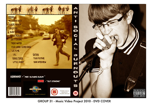
This group have chosen to focus on a rock/punk genre of music for their music video project and this is reflected well within their digi-pack. The image on the front of the digi-pack is really successful as it is a big, close-up image of the main singer rocking out to the music. The image being really big is effective as it dominates the whole cover and draws the attention of the viewer into it. The close-up shot also helps to emphasise this. The genre is also reflected through this image due to the lead singer rocking out and getting lost in the music which is stereotypical of a rock/punk singer.
This group have chosen to focus on a rock/punk genre of music for their music video project and this is reflected well within their digi-pack. The image on the front of the digi-pack is really successful as it is a big, close-up image of the main singer rocking out to the music. The image being really big is effective as it dominates the whole cover and draws the attention of the viewer into it. The close-up shot also helps to emphasise this. The genre is also reflected through this image due to the lead singer rocking out and getting lost in the music which is stereotypical of a rock/punk singer.
The digi-pack also encorporates a ‘parental advisory’ mark on the front cover to stand out to the viewer and make it clear that the intended audience are older teenagers who enjoy rock. Although this does portray target audience they were trying to attract (anti-social/rock styled teenagers) it could be mistaken for a lot older adult audience by the public. The text used in the digi-pack is again effective in portraying the rock styled, anti-social themed group and music by its rough and edgy look.
The colour scheme of the digi-pack is also successful as it links clearly with the groups ideas that they talked about in their previous posts. They talked about how they wanted to include an old style effect in their video in order to relate to the comical policeman idea that they were inspired by, by other artists. They used a sepia colouring effect which emphasises the old 60’s look they were trying to achieve. The digi-pack also includes fun images of the group and a screenshot of the policeman on the back of the cover which link in the music video and the concept of a whole. I also like the way that they have included a barcode and professional music brands/channels comments and reviews as well as a rating for the digi-pack which gives it a more professional and realistic feel as well as again making it clear who the target audience are. Overall this is an eye-catching and effective digi-pack which relates to the genre of the music and target audience well.
Analysing previous students digipack.
Group 13S2-26
 This group have achieved a good digipack to go alongside their music video. It all ties in well with the genre as it is quite dark and mysterious. This is shown with a dark background and a big focus on the guy in the costume lieing down on a very dull couch with a light shining on him/her. The background is very dark so that you know what you should be focusing on. They have thought about the text, which matches the genre. It stays with the dark theme and is eye catching, so will draw the audience to it.
 This is the groups magazine advert which again works well with their music video. The image is of the same location as in part of their video so that there is a direct link betweent the two. The text is the same as their DVD case so there is also a link within the digipack. I like the way they have done their text, as it looks like someone has written it on the bus shelter window. It stands out as an advert so will catch views attention but is also interesting to look at. You want to read the text rather than moving onto the next page.


Analysing previous students digipack.
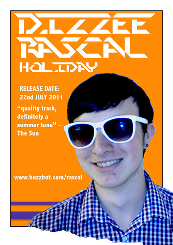
Group 13R1-19 2010/2011
 This is a previous students DVD cover for their digipack. The artist that they have chosen is JLS, which is an upbeat pop group. However the DVD case doesn't suggest this when looking at it. The images are very relaxing and use calming colours, bar the spine of the case which doesn't match the front and back. They haven't thought about the genre to this band, therefore creating the wrong impression. The text is also rather boring and it doesn't catch your eye. I don't think this group have thought about their digipack very well.
 This is the groups magazine advert for their song/album. It is very eye catching due to the bright colours but lacks imagination and technical skill. They have chosen a very simple layout, not trying to think about how they could make the advert more appealing to their target audience. The text is very basic and due to it all being in similar front and size, makes it hard to want to read it. Again this group have not thought through this digipack well.


Shot List
Shots 1-10: All of these shots will be close ups of each indivdual character, the shot will be a mid shot showing an item that they are carrying or wearing. This will give a chance for every character to be introduced before the music video starts properly - Allows the video to start like a story.
Shot 11: This will be a shot of the group of friends all running up and past the camera, this allows the location to be introduced and also to add a bit of interest to the music video - it also fits nicely with out concept and genre as it shows the friendship group with a fun loving quirky feel.
Shot 12: Shot 12 is where the storyline and picnic to actually start properly, the shot shows the characters opening blankets out and setting up a good spot. The group then settle down in a circle.
Shot 13: The group of friends start having a joke around and enjoy the food, the begin to talk as a group . This fits with our genre and concept really well as it shows the strong bond within the friendship group.
Shot 14: Within this shot is will allow alot of close up andf mid shots to be taken of people enjoying themselves. It will add a different feel for the music video and add more contrast between shots.
Shot 15: This is where the food fight actually begins to start, Someone in the group throws some food and it is taken to the extreme. The group then get over excited, and choose their item of food opening them and choosing the person to throw it at.
Shot 16: This will be a long shot, which will show the food fight from all different directions, It also allows for many different characters to be involved in the shot all at once. The shot will show food coming in all shots of directions. This will be a long shot so that we can cut it in different places which are most successful, and also so that we dont miss anything.
Shot 17 and 18: These two shots will also be long shots like before so that we dont miss loads of action. We will so all of the characters coming down a water slide, this allows our concept to come out very strongly as it shows the kind of childish and immaturity of the group. It also attracts to our target audience really well.
First Pitch for Chosen Song Feedback
After pitching our first idea to the song by Jack Johnson - Sitting, Waiting, Wishing we didnt get very successful feedback. Although we were very keen on our idea we found it really difficult to explain our idea in a logical idea. By the end of the pitch, we had a chance to hear the feedback from the rest of our class and our teacher. As a whole they all agreed that our idea was too confusing, but I feel this was mainly because we didnt explain it as well as we could have. Another comment that often came up was that our idea wasnt original enough to be the idea of this song. The lyrics of this song were quite predictable and as a group i dont feel we stretched out imagination as well as we could have done. There were also 3 groups as a whole all going for the same song, this made it quite competitive, but 2 of the ideas were very similar and all of them involved being quite narrative based, which can sometimes be abit risky and boring.
Friday 9 December 2011
Filming and editing our commentary
When filming the commentary there wasn't enough room to fit all five of us in the shot, so we decided on doing 3 of us in one shot and then 2 in the other. This was more practical for us although did take a little longer.
We were given 45 minutes to film our commentary but unfortunately didn't have time to complete the whole thing so some minor details have been left out in the last two questions.
Editing our commentary was quite straight forward, we filmed a lot of extra footage which either was not needed or not able to use.
After we placed the filming of the commentary together we added the questions as titles before the footage of us answering the question so it was clear to the audience what we were talking about.
We then wanted to make our commentary more interesting so we added footage of our music video when we mentioned a certain thing, for example the 'hazy effect.' We also added photos of our digi pak, tour poster and magazine ad, so the audience can draw links between them and what we are saying.
Past Students Commentaries
http://07longroadmusicvideo10.blogspot.com/
This Commentary was slightly different to most of the others, the group decided to show the video and their products and have a voice over, rather than video-ing themselves answering the questions. I felt that this made the commentary feel less formal and would have liked to seen the directors faces, even if it was just for a short amount of time. Although the commentary was very thorough and they answered the questions confidently. I liked the way they used more of a group discussion so you gained every member of the groups view on the question.
This Commentary was slightly different to most of the others, the group decided to show the video and their products and have a voice over, rather than video-ing themselves answering the questions. I felt that this made the commentary feel less formal and would have liked to seen the directors faces, even if it was just for a short amount of time. Although the commentary was very thorough and they answered the questions confidently. I liked the way they used more of a group discussion so you gained every member of the groups view on the question.
Wednesday 7 December 2011
Analysing a Professional Digipack


My Chemical Romance are a popular Rock band from America, they have realeased many albums and songs and when they created their greatest hits album they decided t make it a digipak. On the front cover of the album itself there is a photograph of the band, this introduces them to the target audience which could create more of an interest. over the top of the image My Chemical Romance is written in gold and red. This introduces clearly to the target audeince the image of the band itself, the name of the band and the album that is being released. From the front cover you can clearly see what sort of genre they are, which the theme of black, red and gold. This theme is introducing the genre of the band as a rock band. this is shown clearly through out the whole digipak as a whole.
Inside the digipak itself there are three different sections on the first section there is another image of the band, this is a way for the band to be recognised and also to see what they look like as a whole. The photograph is in black and white which is also staying within the theme of rock as a whole. The next section is for the CD itself. it is designed with the sane concept of the other sections of the digipak showing the colour theme of black and red. The same red splash of paint which is used within the title on the front cover is also used for the CD. Finally the last section of the digipack shows infomation about the band itself and about the making of the songs. This gives a chance for the fans to keep up with whats going on and also so always keep them involved. Finally at the bottom of ther digipak there are more photographs of the band and previous albums that the band have also produced.
Analysing Past Students Magazine Ads
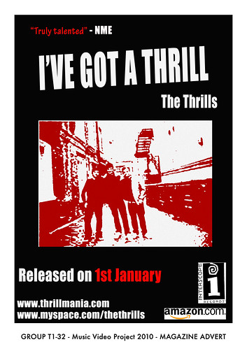
This is an example of a past students magazine ad, throughout the whole ad there is a clear colour theme of black, white and red. This seems to be the main focus for the group, as their magazine ad had a similar look and feel about it, and their main concept throughout.The magazine ad gives a sence of a powerful and dramatic band. The genre isnt that clear to the target audience, it could be related to indie./rock kind of music or it could be rap music. as the colours would match both genres. The ad includes many professional bits of information. The is a quote from NME which are a well know company in the music career. The details of a myspace account where the band can produce and publish infomation about upcoming songs and gigs, they also have a webiste. The most eye catching area of the magazine ad is the image of the band themselves. The title is also very clear to the audience so they know exactly what they are buying. Finally, the release date is shown on the magazine as which shows where the song or album is able to be purchased. I feel that in general this poster is effective as i like the whole concept i feel it works very effectively all together. I feel it is very eye catching, what i feel could be improved is what the genre of the music is and what the band are about.
Tuesday 6 December 2011
Filming our commentary
We filmed our commentary in pairs and a group of three in order for us to concentrate and focus on the points that we were each making. We only had 35 minutes to film our commentary which we found not a lot of time as there was a lot of information to cover between all 5 of us. We did not get chance to film a small section of our commentary due to this and will therefore use a voice over for the remaining information that we need to include. The information included in the rest of our commentary was successful.
Monday 5 December 2011
Evaluation
In what ways does your media product, use, develop or challenge forms and conventions of real media products?
Our groups music video conforms as well as challenges the conventions of real media products, the way the video was pieced together conforms to the conventions seen in other videos, we aimed to use lots of shots with each clip shown for a duration matching with the tempo and style of the music, the music is cheerful and quirky we aimed to show this through our editing techniques, taking inspiration from the style of Noah and the whale and the vaccines we aimed to create a hazy effect over the video to reinforce its quirky image and to create a summery atmosphere which would link in with what was filmed as well as the concept chosen for our promotional pack,
Our video challenges common conventions in that its content does not relate to the lyrics as in most videos but relates to the style and genre of the music.
How effective is the combination of your main product and ancillary texts?
The combination and links between our video, tour poster, digi-pack and magazine ad were, I think, clear throughout, we aimed to show the same quirky image across all products without making all products look as if they had been taken just from the video, as we aimed to create promotional material for a group and album rather than a single track, while we used a screenshot from the video on the dig pack and tour poster we were careful to choose an image for each that could be used generally as apposed to a screenshot that is clearly from a single song the dig pack used a separate shot taken after filming this meant that the album could be differentiated from the single track while still remaining linked by the use of the concept, food.
What have you learnt from your audience feedback?
Initially feedback helped to create the concept for the video as only after critism did realise that our first idea was not as strong as we thought and was to common a theme, from hearing the ideas, critisms and encouragement from other people in the group we were able to create a concept that was unique and suited the style of the track selected,
Our rough cut was not fully complete when shown and our feedback reflected this, while we were told that concepts and filming was good effects, editing and timing all needed to be worked on, from hearing this we were able to focus on the major areas that needed improvement.
For the final showing we were told that it was a big improvement on our rough cut and we had fixed all the problems that were apparent in the earlier versions of the video. From this I have learnt that feedback from people who not take part in the making of the video can allow you to spot flaws that would be overlooked otherwise.
How did you use new media technologies in the construction and research, planning and evaluation stage?
Before our music video project I hadn’t used final cut and Photoshop for much, only my AS work, this project has taught me more of the features of both and how to use them more easily, it has allowed me to greatly develop my skills in video editing aswell as sound editing and how to produce a much more professional looking product by following the conventions used in editing.
Analysing Past Students Digipacks

This was one groups Digipack, as you can see a lot of time has gone into it to plan and designing a concept for the whole idea. From this digipack you can see that it was designed for a pop song. The colours which are involved in the rainbow stripe which is shown across the whole design. The background of the digipack is kept simple in contrast to the bright colours of the stripe. They have used an image of the band as the front cover of the Digipack. The allows the band to be introduced the their target audience. The name of the band is shown in quite bright writing at the bottom of the front cover and at the top of the back. The name of the song itself isnt that clear to the viewer as its only shown on the spine of the Digipack. The could be shown more clearly as a whole - for example on the front of the Digipack so that the target audience know exactly what they are buying.
On the back of the Digipack, the song names are realistic and shown very clearly. There are also screen shots from their video shown which adds more of an interest point through out the Digipack as a whole. They have included Quotes from popular well known music magazines and music channels. Which gives more of a professional feel throughout the Digipack. They have also included a bar code and producers labels. I also like how this makes the work more interesting. As a whole I feel that this is a professional looking Digipack. Although I do feel the title of the song needs to be made more visible, and a tint could have been used over the top of the image of the back to fit with the 'pop' theme.
Sunday 4 December 2011
Analysing previous students final evaluations (directors commentary).
13T1-32 year 2010/2011


Reading the question out at the start i think is a good idea as it makes it easier for the audience. The only thing about it that i don't like is the fact it stays on the same screen for a while, which if you're a fast reader, can be a bit boring. I like the way the guy on the left presented himself sitting quite openly at the camera whereas the guy on the right was quite hunched over. The guy on the right was looking away from the camera quite a bit and also holding the script so visible to the camera made it seem a bit less real and less of a natural response to the question. Having parts of the music video, digipack, Final Cut editing in the background was a nice touch, which made it seem like they had just been working on their video. However the only disadvantge to that was that you can get a bit side tracked if you end up concentrating on the computer screens in the background.
When they switched to the other members in the group, the environment had changed and it made it seem like those two guys were separate from the other two guys. It didn't feel like they were in the same group.
Friday 2 December 2011
Directors Commentary script/notes.
In what way does your media product use, develop or challenge forms and conventions of real media products?
Jack: Noah and the whale, The Vaccines, inspiration, hazy effect
Charlotte: Genre, indie/pop, summer fun, food fights, target audience
Olie: goodwins, lyrics + visuals, music + visuals
Jade: singing, food fight, indie genre
Alex: research into 'pop' video conventions
How Effective is the combination of your main product and ancillary texts?
Charlotte: music video, food fight, preparation
Olie: digi pack, how we made it, screen shots, energetic
Jade: tins, wrappers of food in video, clear links, writing on tins
Alex: fonts similar/same, effect same as video
Jack: Tour dates poster
What have you learnt from your audience feedback?
Olie: initial pitch 'Jack Johnson', not great feedback
Jade: 'We're from Barcelona' heard lots of great ideas
Alex: rough cut, rushed, wasn't finished, no singing
Jack: final improvements, added shots, colour corrector, added singing
Charlotte: over all how feedback helped us.
How did you use new media technologies in the construction and research, planning and evaluation stage?
Jade: final cut, rewind, fast, slow, colour corrector
Alex: photoshop, magazine ad, text, layers, easy to use
Jack: blogger, research, planning, easy to use
Charlotte: HD cameras, tripod, stills camera
Olie: how everything helped our video to be amazing!!
Evaluation.
In what ways does your media product, use, develop or challenge forms and conventions of real media products?
Our media product that we have created has been inspired in different ways by real media products. Quite a big influence was that of the music videos by 'Noah and the Whale'. Their videos have a hazy effect over their footage, which was the same effect that we wanted to create.
With the genre of the music we neeed to make sure everything matched that style. the music is quite upbeat and happy so we needed to make sure that this was the message that our whole media product gave. We chose a summer picnic/food fight was we thought that this fitted in with the genre of the song. We didnt really show any visual/lyrics match but the visuals were very much at the same pace as the music, this made it all flow nicely together. The lip syncing we did was done effectively and worked well with the rest of the footage as the singer had food thrown at her, keeping the same theme all the way through the music video.
How Effective is the combination of your main product and ancillary texts?
I think that all three products work very well as a promotional package. We also decided to add a fourth part to the promotional package, so we have; a music video, DVD case, a magazine advert and the tour dates poster.
The DVD case and tour poster have a picnic/food theme due to us using screen shots from our music video. The shots we have used give the impression of a relaxed atmosphere, fun with friends, nice summer days, etc. They are the main concepts that we were trying to create.
The magazine advert has gone with more of a food theme, due to the video being about a food fight. We took photographs of food that was used in the video to add a bit of continuity to the advert. We then changed the branding to information about the song like release date, website, artist and song, etc. This worked well as the image fitted in with the theme across all the promotional packages.
Our promotional package works to the audience that we are trying to attract. This is of young teenagers to young adults. The themes of our products appeal more to this kind of audience rather than the older generation.
We are pleased with our digipak but I feel there was room for improvement on it. To start with we spent a lot of time on the magazine advert, which took a lot of editing. This meant that when we got to the other products we didn't have as much time. Therefore they could've been better than they are.
What have you learnt from your audience feedback?
We didn't get the original song that we pitched for as there were 3 groups pitching and our idea was too obvious and not very imaginative. This inspired and pushed us to think of a really good idea for our second pitch. We have then since expanded on the picnic/food fight idea to create our final product.
It was a bit hard with the feedback we got from our rough cut because we hadn't got a lot of the footage edited. Once we had tough we got some good feedback about the video. People liked the idea of the food fight and how we had edited it. Our teacher said that we needed to add more close up footage to get a bit more shot variation. We needed to add colour corrector over the clips too, which will make the video look more professional and less home made.
With colour corrector added over the top of the clips to give that hazy effect and a few more close up footage, we got a good response from our peers and teacher. The video looked a lot better with colour corrector over the top but would've liked a few more close up shots or reaction shots. We were also told how the singing fits well with the main footage, as food was being poured on the singer so it linked in with the other video footage.
How did you use new media technologies in the construction and research, planning and evaluation stage?
The software that we have used to create the video and the promotional package are Final Cut and Photoshop. We then recorded all our research onto our group blog on blogger.com. Our video was captured on a HD handheld video camera and we took photographs for our magazine advert using a stills camera.
Final Cut was used to edit the video, which felt fairly easy due to havi used Final Cut a lot in the past year. Final Cut had everything that we wanted to do to our music video, some of which we had to be shown like the rewinding effect. Once we knew how to do it we were able to use the effect well with our music video.
Photoshop was used for the promotional pack, helping us edit the images to give them certain styles and to add text. It gave us the look that we wanted our pack to have and allowed us to achieve this fairly easily.
Blogger.com is nice and simple to use, allowing us to record our research when we wanted.
Directors Commentary.
A directors commentary is a way of giving more information to viewers about the media product that they have created. It normally is video footage of the product that they have made with the director then answering questions over the top. The questions will normally be about how they made certain parts of their product, what was challenging, what they are most pleased with, etc. This all helps the audience to engage with the media product more so than just watching it.
Thursday 1 December 2011
Evaluation
In what ways does your media product, use, develop or challenge forms and conventions of real media products?
Our media product uses, develops and challenges forms and conventions of real media products in different ways. Our music video is stereotypical by the way that it uses Goodwin’s ideas of a media product. The song we chose for our music video is a very quirky and upbeat song which for me reminds me of summer and makes me smile. For example it demonstrates genre characteristics by the way in which the visuals in the music video and also editing techniques are quirky and upbeat to match the style of the song. As the song reminded us of summer and gave us the idea of having a group picnic we wanted to reflect this fun and energetic summer feel within our video. We filmed on a sunny day but also edited in a summery/hazy feel to the visual creating an almost vintage memory style visual for the viewer which we felt worked really well. We also gained inspiration to do this idea from watching other products that we have analysed. One of these was from the artist Noah and the Whale whose lively visuals and songs are really addictive for their audience. In one of their videos they played around with a vintage style hazy effect and we thought that it was really effective and gave an extra element of fun to the video and therefore decided to experiment with it in our own video. Also in this way there is a relationship between music and visuals as the upbeat music and beat within the track is reflected within our video due to the style and pace. Lyrics and visuals are also explored thoroughly by our footage of a lively group of friends having fun on a summery day, which is a theme reflected within the lyrics of the song.
We did also develop and challenge the forms and conventions of real media products as we wanted to make our video more exciting and entertaining for our viewer. As we wanted to really emphasise the liveliness and originality of the song that we chose in our video we decided to play around and experiment with different things throughout the process, some of which failed and some of which were successful. One thing that we found really successful and thought added a lot of fun to the video was using a fast forward/rewind technique on some of our footage. When editing we added the technique to some of footage showing our characters doing something. The footage would then rewind slightly and they would do the same thing again. We thought that this was really effective as it emphasised the specific actions and also is different to any other effects/techniques that we have seen when analysing other music video’s recently.
How effective is the combination of your main product and ancillary texts?
I think that the combination of our main product and ancillary texts are very effective as they have a clear link. We based the theme of our ancillary texts around the main themes apparent within our music video which are fun and food, although we did take into account the fact that the ancillary texts are representative of say an album and still thought that due to our artists quirky and lively representation that this was still expressed through the ideas that we used. For our ancillary texts we created a magazine advert promoting our music video, a Digi-pack and also an extra tour poster which we feel all work together to create an effective promotional package. We used screen shots from our music video for both the Digi-pack and Tour poster which we thought would look effective. These were group shots emphasising the energetic, together feel of the artist overall and chose quirky fonts, and bright, summery colours to emphasise this even more. For our magazine advert we used a well composed photograph of food which relates to our picnic scene in our video as we thought that it was very eye catching. We feel that overall the set of 3 ancillary texts do continue to communicate the idea of a quirky artist and summer fun concept to their work which is apparent in our music video. We feel that we have appealed to our target audience of male and female teenagers and young adults due to the quirky and original ideas and theme that we have used throughout our products. We feel that being original with ideas really stands out from the crowd.
What have you learnt from your audience feedback?
Receiving feedback from both peers and other students was really helpful as it allowed us to be able to expand on and improve our ideas. We had criticism on our original idea that we pitched for as others felt that it was not an original enough idea. Even though receiving negative feedback was a knock for us, we also felt that it was beneficial as it gave us a chance to rethink our original ideas and why they were not very successful and achievable. We then chose to pitch for our second choice of song which we all felt was more suitable due to the amount of fun and different ideas that we were coming up with. We chose this song after we had positive feedback on our ideas as they had a unique and quirky concept that seemed to stand out.
The feedback from the rough cut of our video was fairly positive as both peers and teachers thought that our idea and concept and also footage was successful but we just needed to tweak and add some more to the video in order to make it more entertaining for the viewer. We found the feedback really useful as it allowed us to identify specific aspects of the video that needed a bit more work and focus on improving them. The negative feedback received was mainly based around our editing and the fact that it was quite boring and repetitive. We also did not have any shots of the song being sung in our video and upon receiving this feedback realised that this was something that would improve our video a lot. We received positive feedback about our reversing technique which we ourselves though was successful so decided to include this technique in more of our video as we thought it was really creative.
Overall, the feedback we had throughout the process was really beneficial as it allowed us to get another opinion on our work and have the chance to improve and add more to it in order to make the final product as successful as possible.
How did you use new media technologies in the construction and research, planning and evaluation stage?
Media technologies available to us throughout the music video process were really helpful as they allowed us to create a really successful final product. We used Blogger to document our planning, researching and developments throughout the project. Blogger was really useful as it allowed us to quickly jot any ideas on it and then edit and view them when needed. It also allowed us to document our inspirations and research into other media products and also compare them to our own ideas and products easily. Final Cut was the software that allowed us to create our music video and this was an essential. Final Cut is a really good program as it is quite advanced and therefore has a lot of capabilities. It allowed us to create a really professional final product and also use many exciting and new techniques and editing effects that we had not used before in our video. I found I was able to experiment more and explore Final Cut within this project due to our quirky style of video as we experimented with fun filters and effects that Final Cut had to offer. Photoshop is an advanced digital editing software which we created our final magazine advert, digi-pack and tour poster products on. We also created various mood boards and planning items earlier on in the project using it as it had endless possibilities and for me is really easy to use. Using all of these programs allowed us to create a very professional and well made set of products overall.
The HD cameras were also a really useful piece of equipment as they allowed us to capture high quality and a wide range of shots when filming. We also used the HD camera to take still shots all throughout the music video project and all of these came out successfully. The tripod that came with the camera was also really beneficial as it made sure that our footage was not shaky and blurry due to instability.
Overall all of the technologies used allowed us to be really creative and innovative as in the various stages of creating our final product we were always able to record our ideas and inspirations clearly and effectively or access high quality and professional equipment easily. I would say that in terms of creating a professional image that higher quality DSLR cameras would have been useful as these are much higher quality than just a standard stills camera.
Subscribe to:
Posts (Atom)