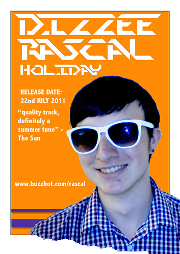
this is a magazine advert made by a previous group and was one of the bet ones I saw, it follows most of the conventions expected in a magazine advert playing focus to the artists name, the effects and styles used are effective but do not completely comply with the desired genre, the torn effect and offset of the photo at the bottom of the page are both eye catching features but means that the size of the advert will have to be reduced on the page making the information smaller and therefor less noticeable, the photo itself is of good quality and clarity but looks as if it has been put through a blue filter which doesn't stand out enough to become eye catching and instead reduces the quality feel of the page.
the information included on this advert is;
- artist name
- album name
- release date
- review
- website
it could do with having more information added ,e.g publisher info, to make the product look overall more proffesional.
No comments:
Post a Comment