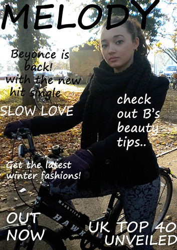
Here is a magazine ad by previous students for their music video project. They focused on an R&B genre for their music video due to the style of song that was chosen. Although the magazine ad is not particularly suggestive of the R&B genre or slow, romantic styled song it does represent the genre by the way that the artist is a young, dark haired and olive skinned female as a lot of R&B signers in the current industry have this representation. I do not however feel that the magazine ad is at all successful due to the unprofessional and rushed feel to it. It also does not feel as if the group have thought about the genre and their idea properly although the written work on their blog does contain a lot of ideas. In my opinion they seem to have misunderstood the task and created a magazine cover rather than a magazine ad promoting their artist/song.
Firstly, the image they have used on their background does not feel very professional due to the artist being sat on a bike in front of random buildings and trees. On their blog the group commented on how they had taken the images surrounding trees to link in with their music video and some shots in it but in my opinion this is too vague and does not relate to the style or genre of the song particularly well. The magazine ad also has an extremely unprofessional feel due to the font styling, colouring and placing. The group have used the same font, a pretty standard styled font that does not particularly portray a girly female artist, throughout their magazine ad. They have also used really plain colours for the font such as black and white which again are not suggestive of the girly and romantic styled song, or eye catching enough to stand out against the busy background. With the font they have also placed it quite randomly and this looks untidy and is not very well composed with the image they have used. They also mention quite random and magazine cover styled phrases on their magazine ad e.g. ‘get the latest winter fashions’ which do not promote the song or artist very well. The unprofessional feel is again emphasised more by the magazine ad not having any professional music companies/brands logo’s on the magazine ad. The cover would have looked a lot more professional if there were reviews or ratings of the artist/songs work or by letting the viewer know which retailers are selling the product.
Overall the group have not portrayed or emphasised the style and genre of the song and artist enough in their magazine ad. It also feels really unprofessional by the rushed, untidy layout and lack of creativity throughout.
No comments:
Post a Comment