Showing posts with label Alex Shaw. Show all posts

Thursday, 15 December 2011

Editing of our Music Video


These are screen shots of our project in final cut, we used different lines as we felt this was a lot easier to move about and everything wasn't squashed together.

Our Music Video Commentary


This is our final commentary for our music video. 

Wednesday, 14 December 2011

research on a music video director


Anthony Madler is a thirty four year old music video director who has had experience starting from 1998 and in the time from then till now has directed or co-directed a mass of high end, high profile music videos for A list artists, beginning his career in media as a photographer for magazines such as the EPSN monthly magazine, he has to date directed over 80 music videos with artists including;
  • Black eyed peas
  • Snoop Dogg
  • Rihanna
  • Jay-Z
  • Muse
  • and Beyonce
he currently has begun to direct feature length movies and is Directing the movie 'Vlad'.


http://www.youtube.com/watch?v=rp4UwPZfRis&ob=av2e 

Auteur Theory


Auteur Theory is where the director is given full control over the creation of the media product ,e.g music video, and the director can be seen as the creator of the video rather than just piecing together pre-designated ideas and shots, this has lead to, in films for example, for the directors name to be the main one in the credits as the composition of shots, lighting and mise en scene are more important for the feel of the video than the literal speech,  as apposed to the screenplay writer as you might expect.

Analysing A Professional Digipack


This is Nero's latest album digipack, the theme used across the entire album was retro futuristic and this can be seen clearly throughout the design with the old arcade space invades style font and angular shapes this logo is used across all of neros publications. 

The product is fairly simple in an attempt to draw focus to the group name with a picture of two people most probably the two members of Nero on what appears to be a space age landscape, again fitting in with the concept chosen throughout, the disk art and back cover are kept to a minimum with little unessential info and what is there is kept to a minimum using small fonts and pushing things such as publisher info into the corners to create negative space, used to draw the onlookers eyes to the band name, which is the only thing using bold crisp white colours.

Overall i think that this digipack is a perfect example of a proffesional product and shows clearly how effective a choice of font, layout and styling can be used to create and enforce a theme which can be carried across multiple products.

Analysing a past student digipak


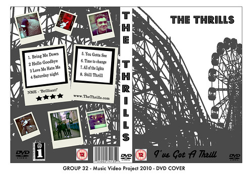
13T1-32 Music DVD Cover


this past student digipack dvd cover, there artist name is the thrills and clearly the roller coaster imagery in the background fits well with the name the picture is used effectively and the way in which it stretches across both front and back really adds to the professionalism however i think the spine should continue the picture as well as to not break up the image, the way in which photos and track info has been added to the back of the product really suits the rest of the styling as the polroid style printouts go well hand in hand with the theme park concept.

the only major problem with this otherwise proffesional looking product is that the information such as the BBFC rating and bar code looked rushed as they are inside a white box and as such look copied and pasted from Google. If not for that one problem i think that this digipack could easily pass as proffesional. 

research into directors commentaries

A directors commentary is usually a voice over or footage of the creator of a media product talking about and justifying decisions made throughout the creation of the product, this could be why they chose the location or actors, style or any number of things in the video, it is created to enable the viewer to grasp a better understanding of the product so that it can be enjoyed on a different level than the norm. it is often shown over the top of or with clips of the actual product, this allows the director to be specific about what they are talking about as if the viewer were watching it with the director.

past student commentary

http://31longroadmusicvideo10.blogspot.com/

this groups commentary was different to most other groups i saw, it started with a brief clip of there music video then the first question faded over the top before a transition to the group sitting together, this was effective in the sense that it gave the viewer a clear sense of which video and what part of it the group were talking about. The group had chosen to make the video in the style of the interview, and while they pulled this off well it didn't make the product look convincing and proffesional as most real commentaries show only the artist or artists between clips of footage, they however filmed parts of the production process (e.g final cut) which really helped to get across to the viewer what they were trying to describe and also added a proffesional look to the product.
 The group seemed confident in there speech and it sounded like they had for the most part planned it out well and were clear on what needed to be discussed without making it look as if it was being read of a script.

Analysing a past groups magazine ad

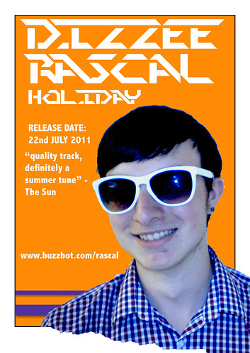
Music Magazine Advert Template
http://34introtomusicvideo11.blogspot.com/

this is a magazine advert made by a previous group and was one of the bet ones I saw, it follows most of the conventions expected in a magazine advert playing focus to the artists name, the effects and styles used are effective but do not completely comply with the desired genre, the torn effect and offset of the photo at the bottom of the page are both eye catching features but means that the size of the advert will have to be reduced on the page making the information smaller and therefor less noticeable, the photo itself is of good quality and clarity but looks as if it has been put through a blue filter which doesn't stand out enough to become eye catching and instead reduces the quality feel of the page.
the information included on this advert is;

  • artist name
  • album name
  • release date
  • review
  • website
it could do with having more information added ,e.g publisher info, to make the product look overall more proffesional.

Tuesday, 13 December 2011

Analysing a professional magazine ad


this magazine advert for chase and status is made to promote the groups album tour its imagery bares no literal relevance to any tracks in the album but is used to underlay a concept to be used throughout, as we see the same images twinned with the same fonts and styles in all album related products {e.g digipack). having this lack of relevance allows you to see the album as a separate product rather than following the styles of a single individual track. the choice of colours allows the writing to be easily read and to stand out amongst the background creating a 3d style effect.
 the layout of the advert draws focus to certain aspects of the information the groups name is largest on the page with the venue second this makes it clear to the reader what the advert is promoting, where as for example if the venue was larger it would look as if it were that witch was being mainly promoted.
All relevant information is included on the poster shown in order of importance down the page with the date first followed by contact details,ticket website details, album details and group website details.The producers details have been placed in the lower corners as to be prominent but without drawing the readers eye from other aspects of the page.
overall this advert clearly outlines all key information needed while still showing the key styling of the tour allowing the page to be both eye catching and informative

Friday, 9 December 2011

Filming and editing our commentary

When filming the commentary there wasn't enough room to fit all five of us in the shot, so we decided on doing 3 of us in one shot and then 2 in the other. This was more practical for us although did take a little longer.

We were given 45 minutes to film our commentary but unfortunately didn't have time to complete the whole thing so some minor details have been left out in the last two questions.

Editing our commentary was quite straight forward, we filmed a lot of extra footage which either was not needed or not able to use.

After we placed the filming of the commentary together we added the questions as titles before the footage of us answering the question so it was clear to the audience what we were talking about.

We then wanted to make our commentary more interesting so we added footage of our music video when we mentioned a certain thing, for example the 'hazy effect.' We also added photos of our digi pak, tour poster and magazine ad, so the audience can draw links between them and what we are saying.

Tuesday, 6 December 2011

Filming our commentary

We filmed our commentary in pairs and a group of three in order for us to concentrate and focus on the points that we were each making. We only had 35 minutes to film our commentary which we found not a lot of time as there was a lot of information to cover between all 5 of us. We did not get chance to film a small section of our commentary due to this and will therefore use a voice over for the remaining information that we need to include. The information included in the rest of our commentary was successful.

Monday, 5 December 2011

Evaluation

  
In what ways does your media product, use, develop or challenge forms and conventions of real media products?

Our groups music video conforms as well as challenges the conventions of real media products, the way the video was pieced together conforms to the conventions seen in other videos, we aimed to use lots of shots with each clip shown for a duration matching with the tempo and style of the music, the music is cheerful and quirky we aimed to show this through our editing techniques, taking inspiration from the style of Noah and the whale and the vaccines we aimed to create a hazy effect over the video to reinforce its quirky image and to create a summery atmosphere which would link in with what was filmed as well as the concept chosen for our promotional pack,
Our video challenges common conventions in that its content does not relate to the lyrics as in most videos but relates to the style and genre of the music.

How effective is the combination of your main product and ancillary texts?

The combination and links between our video, tour poster, digi-pack and magazine ad were, I think, clear throughout, we aimed to show the same quirky image across all products without making all products look as if they had been taken just from the video, as we aimed to create promotional material for a group and album rather than a single track, while we used a screenshot from the video on the dig pack and tour poster we were careful to choose an image for each that could be used generally as apposed to a screenshot that is clearly from a single song the dig pack used a separate shot taken after filming this meant that the album could be differentiated from the single track while still remaining linked by the use of the concept, food.

What have you learnt from your audience feedback?

Initially feedback helped to create the concept for the video as only after critism did realise that our first idea was not as strong as we thought and was to common a theme, from hearing the ideas, critisms and encouragement from other people in the group we were able to create a concept that was unique and suited the style of the track selected,

Our rough cut was not fully complete when shown and our feedback reflected this, while we were told that concepts and filming was good effects, editing and timing all needed to be worked on, from hearing this we were able to focus on the major areas that needed improvement.

For the final showing we were told that it was a big improvement on our rough cut and we had fixed all the problems that were apparent in the earlier versions of the video. From this I have learnt that feedback from people who not take part in the making of the video can allow you to spot flaws that would be overlooked otherwise.

How did you use new media technologies in the construction and research, planning and evaluation stage?

Before our music video project I hadn’t used final cut and Photoshop for much, only my AS work, this project has taught me more of the features of both and how to use them more easily, it has allowed me to greatly develop my skills in video editing aswell as sound editing and how to produce a much more professional looking product by following the conventions used in editing.

Friday, 2 December 2011

Directors Commentary script/notes.

In what way does your media product use, develop or challenge forms and conventions of real media products?

Jack: Noah and the whale, The Vaccines, inspiration, hazy effect

Charlotte: Genre, indie/pop, summer fun, food fights, target audience

Olie: goodwins, lyrics + visuals, music + visuals

Jade: singing, food fight, indie genre

Alex: research into 'pop' video conventions


How Effective is the combination of your main product and ancillary texts?

Charlotte: music video, food fight, preparation

Olie: digi pack, how we made it, screen shots, energetic

Jade: tins, wrappers of food in video, clear links, writing on tins

Alex: fonts similar/same, effect same as video

Jack: Tour dates poster

What have you learnt from your audience feedback?

Olie: initial pitch 'Jack Johnson', not great feedback

Jade: 'We're from Barcelona' heard lots of great ideas

Alex: rough cut, rushed, wasn't finished, no singing

Jack: final improvements, added shots, colour corrector, added singing

Charlotte: over all how feedback helped us.


How did you use new media technologies in the construction and research, planning and evaluation stage? 

Jade: final cut, rewind, fast, slow, colour corrector

Alex: photoshop, magazine ad, text, layers, easy to use

Jack: blogger, research, planning, easy to use 

Charlotte: HD cameras, tripod, stills camera

Olie: how everything helped our video to be amazing!! 

Thursday, 24 November 2011

Final Digi Pack Ideas.

The theme for the whole digi pack is Summer with Food.

Magazine Ad:

For our magazine ad we are using a picture of some of the food used in the filming, that is set out well in front of a white background. The food takes up the top half of the picture the there is a white space in the bottom half which we are going to use for text of the magazine cover. We are blanking out the brand names of the food products and replacing them with information about the track such as release dates, where its available from, etc. 

DVD Case:

We are going to use a shot from our music video for the front of the case, which is of the group running away. There is a big clear blue sky that we can put the title of the album and name of the band. We are thinking of calling our album 'We're From Barcelona'. Many bands call their album by one of their main songs so we thought we could do the same. This way we can also use a photo from our video as it will relate to the album. For the back of the album we are going to use a till receipt as this is going with the idea of food as part of the theme. We will change the items on the receipt to track names and the prices changed to the track length. 

Tour Poster:

We are going to make a poster with all the tour dates on it as an extra leaflet inside the DVD/Album pack.

Tuesday, 22 November 2011

Digi-pack and Magazine Advert Concept

for our digi-pack we have chosen to have a shot of the band on the front of the cover using a shot that wasn't included in the filming to try and separate the digi-pack from the individual track, the inside of the pack will be a shot of the entire group shown in film stretching across both sides of the inside cover. the back cover will be a shot of a till receipt with the track information and other info printed onto it, the magazine ad will be a shot of food but with the album information printed onto well known food labels (e.g heinz beans.

Thursday, 3 November 2011

Feedback for rough cut from Andrea and Amar.

Positives: 
- You can sense a good vibe
- There are nice pans and a few zoom shots
- Good editing in time with the beat of the song
- Stereotypical, a fun song with a fun image to go with it; food fight

To Improve:
- Show each character at the beginning for longer so you can see who they are and what they are holding
- Have more close-ups to vary the shots, to get some reactions
- When shooting the performance footage get a lot of close-ups and try to make the background something other than green bushes. This is to make the audience establish that they are taking place in different places.

We are going to shoot the performance shots tomorrow, friday 4th November, and will use the guidance given to us by Andrea and Amar. We are also going to make the clips of people at the start longer so you can see what they are holding and recognize the character. We are going to look through the clips to see what close-ups we have then try to incorporate them into the video so we get a variation of shots.
 
© 2009 13R2-20 Music Video 2011. All Rights Reserved | Powered by Blogger
Design by psdvibe | Bloggerized By LawnyDesignz